Life OS is my oldest app, so it has the most embarrassing baby photos. This is part 1 of 5, and the next few posts are all before/after: what I started with, where it is now, and the mess in between.
Day one: a poster, not an app
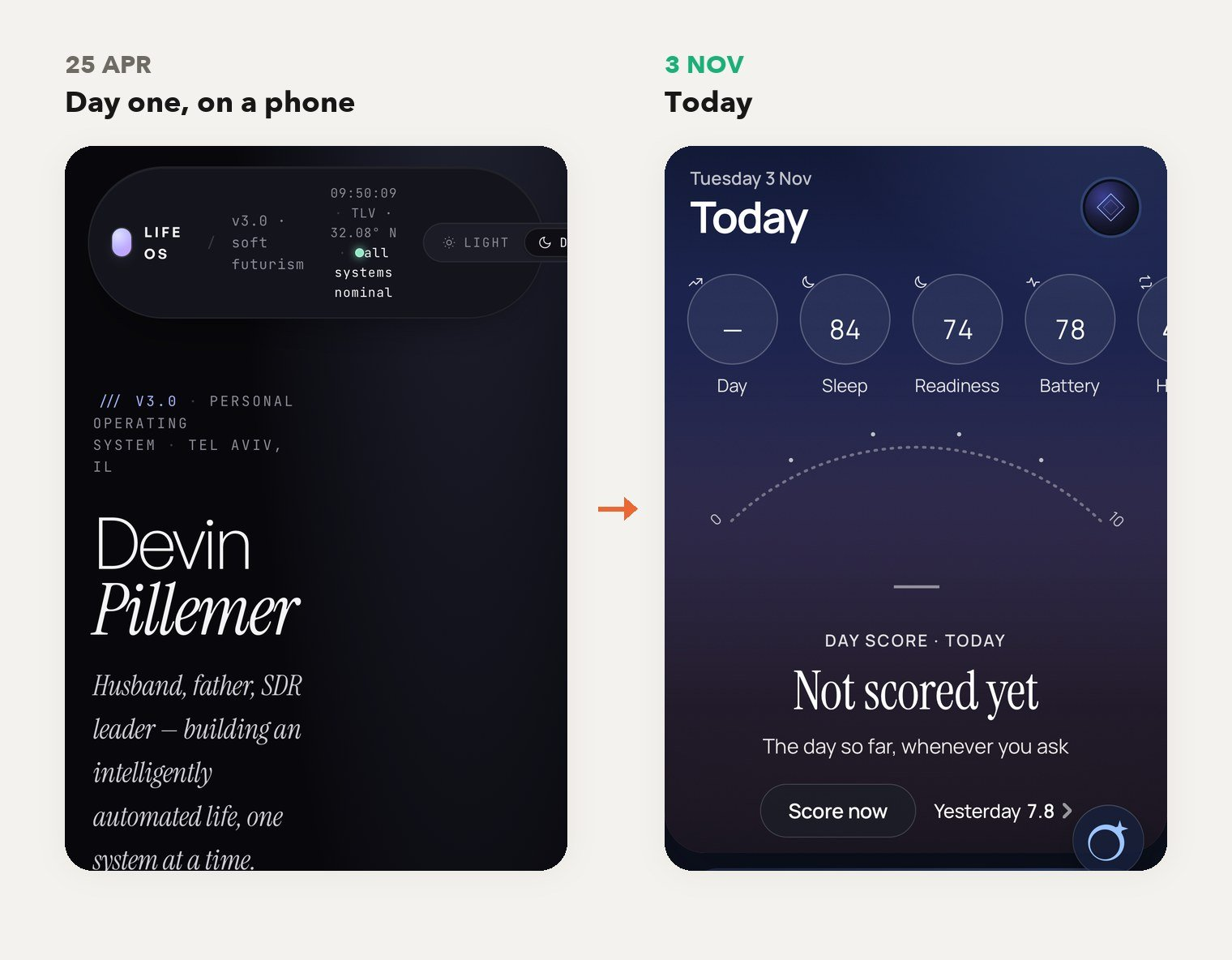
- Same phone, left side first. Look at the header. On 25 April it wrapped into a tall pill of tiny text. My own name ate the entire first screen. Very humble.
- It was built for a desktop. “Life OS v3.0 · soft futurism” had a dark background, giant serif type, a row of stat cards and nine tabs, from Identity to Goals. It looked gorgeous on a monitor and was useless anywhere else.
- The first evening was a fight. I built it in one day, and every commit that night went to a flashing panel animation and a clock that re-rendered the whole page every second.
- One number on day one is blurred on purpose.
1,113 commits later
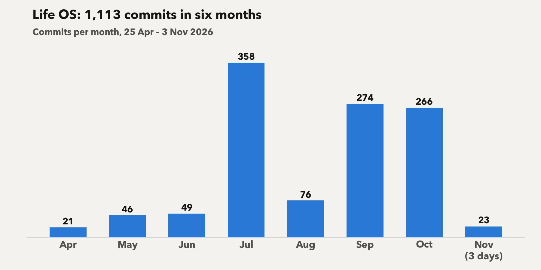
- Look at July. 358 commits went into an architecture cleanup and a full design audit: touch targets, focus rings and light-mode colours that weren’t an afterthought.
- The quiet months mattered too. May added a chatbot inside the app and June added a password gate. On 31 August I made it “stop the dashboard painting at 60fps for nobody”. My battery sends its thanks.
- Then autumn took off. September brought a separate phone shell with a demo mode on dummy data. That’s why every “now” shot here shows nothing personal.
The Today screen, five times
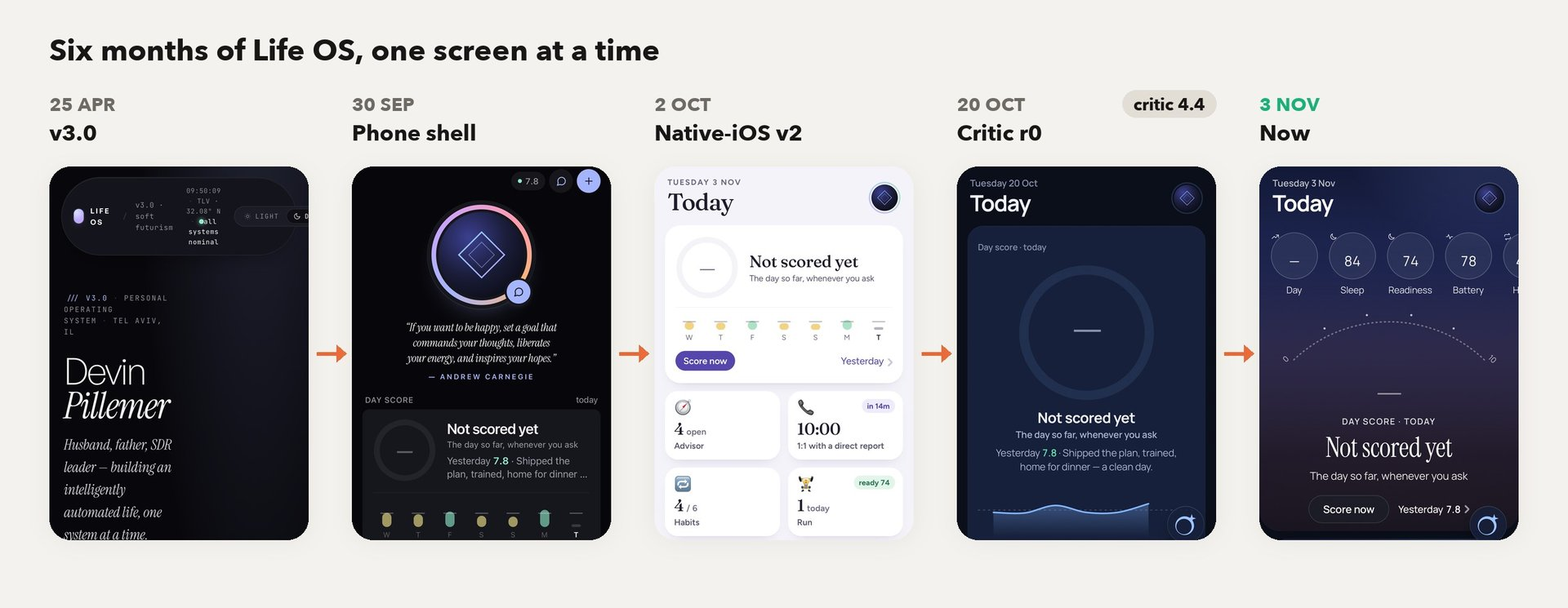
- 2 October was the real turn. “/m v2” made it feel like a native iPhone app: one screen per tab, with tiles that open sheets. It finally lives on my home screen next to the real apps.
- 20 October: the critic shows up. An AI scores every screen against real screenshots of the best app in the genre. Today got 4.4/10, and the six screens averaged 5.2. Humbling, from a robot.
- About 10 rounds later the average was 6.2–6.4 and Today peaked at 6.1. Past roughly 7 the critic starts contradicting itself, so we stop there and ship the best variant.
- Compare the last two frames. On 1 November every emoji went and real photos replaced them. On 2 November I rebuilt the phone tabs from real Oura screenshots, with Whoop’s score colours, so Readiness now shows what drove it.
Six months ago this was a desktop poster with my name on it. Today it’s an app I actually open. Yalla, part 2 next.
Also today
- A before/after figure maker for this series. It builds the pairs, timelines and blurs you just scrolled past.
- A “clean” mode for the design critic. Every change now has to take something off the screen, not stack something on.
- Trippin’ Out got the clean pass: fewer blocks, one accent and a calmer Money screen. It’s now the house design standard.