In part 1 my dashboard couldn’t fit on my phone. This time the problem is taste, which you can’t unit-test, so I turned it into a loop: an AI critic puts my app next to the best app in its category, scores every screen out of 10 and names three changes, then we go again.
Meat Night vs Beli
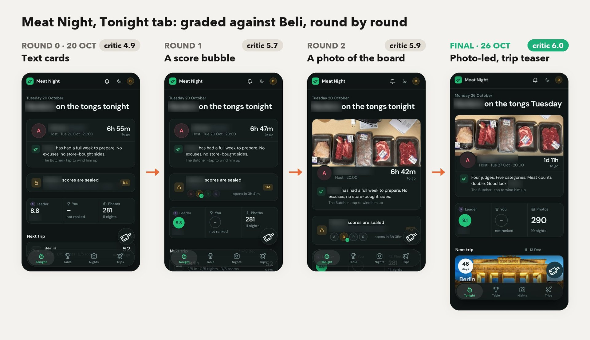
- Round 0 scored 4.9. Look at the first phone: a column of text cards where every number is the same size.
- Round 1 borrowed Beli’s round score bubbles and scored 5.7. The critic’s next note was that there was no photo anywhere, even though the crew has 281 of them.
- Round 2 put the meat board at the top of the host card. The critic then flagged that the crop showed “a plug, a Ninja box, papers.” Fair enough.
- It took 14 runs to peak at 6.7 in round 7.
The critic doesn’t do vibes
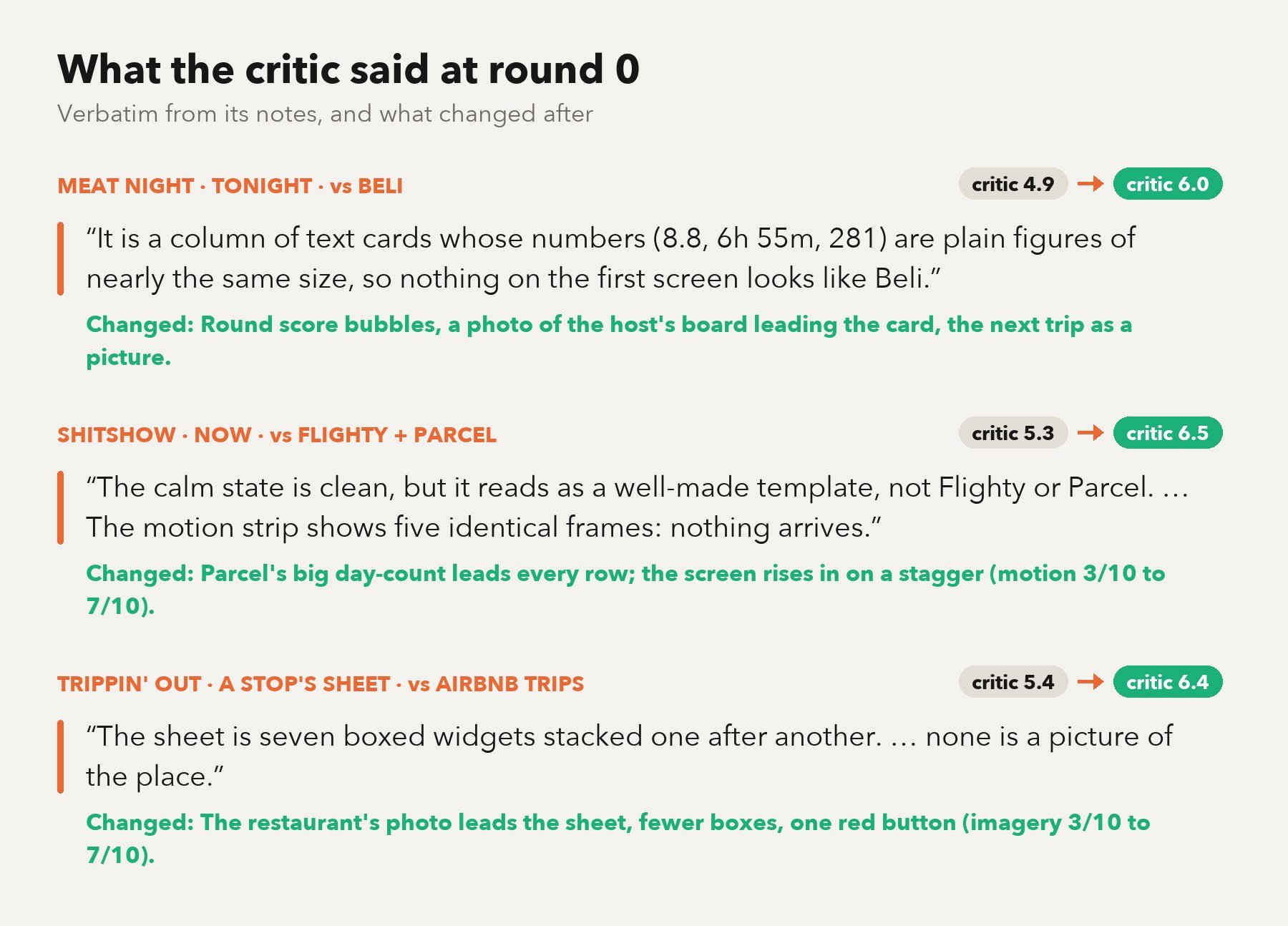
- The critic always names exactly three changes per screen. I apply them, recapture on an emulated iPhone 15 Pro (dark, light and a frame-by-frame motion strip) and rescore. That’s one round.
- The leader gets scored too, against itself, so I know where the ceiling is.
- Friends’ names are blurred on purpose.
Shitshow vs Flighty and Parcel
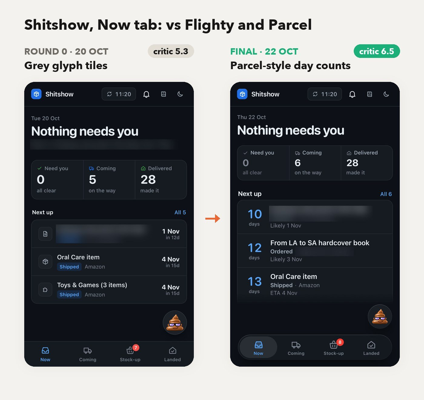
- The round 0 verdict: “a well-made template… five identical frames: nothing arrives.”
- The fix was Parcel’s big day count leading every row, plus a staggered entrance. Look at the left edge of each row.
- Motion went from 3 to 7 and the screen went from 5.3 to 6.5 in two days. At 6.5 it still called it “a tidy dashboard template.” Ouch.
Trippin’ Out vs Airbnb Trips
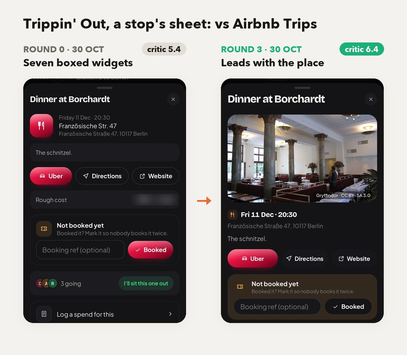
- Before: “seven boxed widgets stacked one after another… none is a picture of the place.”
- After: the sheet opens on the restaurant itself, and imagery went from 3 to 7.
- 5.4 to 6.4 in three rounds, all in one afternoon.
The scoreboard: 16 apps, nobody near 8
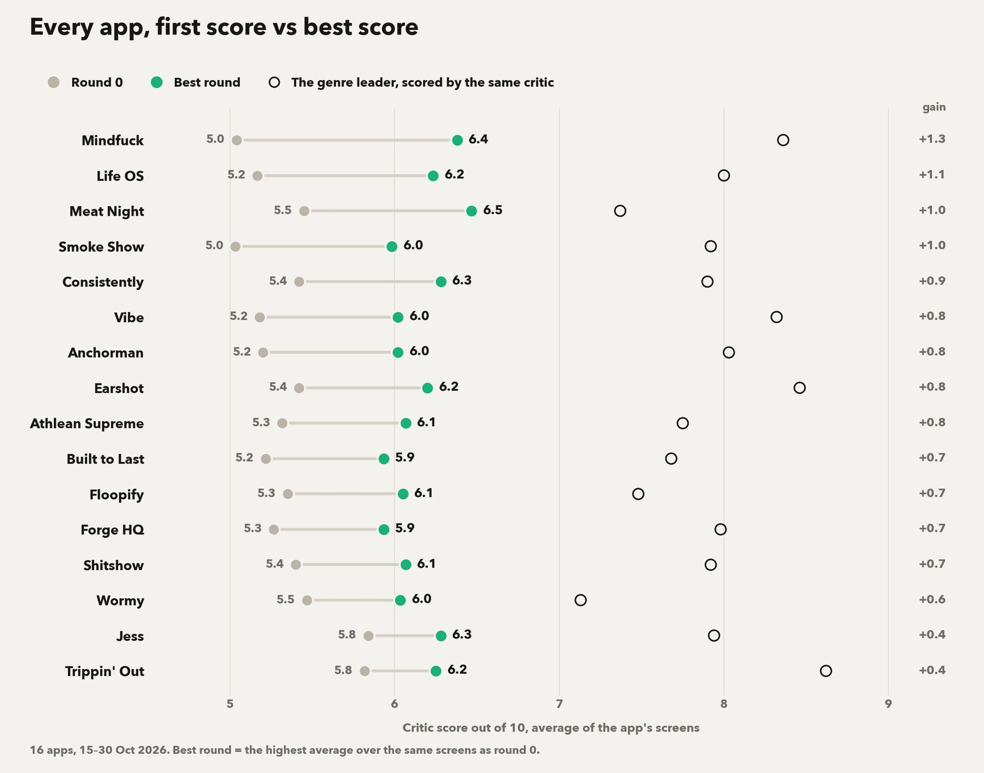
- It ran 82 times and produced 437 screen scores in two weeks. Every grey dot starts around 5, and every green one sits roughly a point to the right. Mindfuck climbed the most (+1.3). Trippin’ Out and Jess, which started highest, gained only 0.4.
- The rings sit up around 8 and nothing of mine reached them. The critic keeps asking for real photography, motion and row density, and CSS can’t fake those.
- Past about 7 the critic starts flip-flopping. Shitshow’s Stock-up tab went 5.1, 6.4, 6.3, 5.5, 5.3, 5.9, and run-to-run noise is about ±0.5. So my rule is that when a round reverses the one before, I stop, ship the best version of each element and report the gap honestly.
- Since 22 Oct it runs on my Claude subscription, at about a minute per screen and no API spend. Before that, each run cost about $0.70–0.80.
Also today
- Anchorman now opens each story on its summary and lets me read the whole article inside the app.
- Built to Last got six clean-up rounds. Lior is now on the page and the choices sit in the thumb zone.
- Life OS took the family portrait off every screen, and the desktop now leads with the quote. Yalla.