Last time, in part 3, the critic dragged seven of my apps out of template land. Then on 1 November I looked at all the little cartoon hotels and sparkles scattered across my screens, declared the cheap-looking emoji shit officially dead, and asked for lifelike, proper art instead. Yalla.
The rule, and what replaced it
- No emoji anywhere a person looks: tiles, chips, buttons, empty states, page titles. The test is simple. If it draws as a colour emoji, it goes.
- Anything that carries meaning gets a real picture: a real photo, your own photo, or the app’s own art. Controls keep plain line icons.
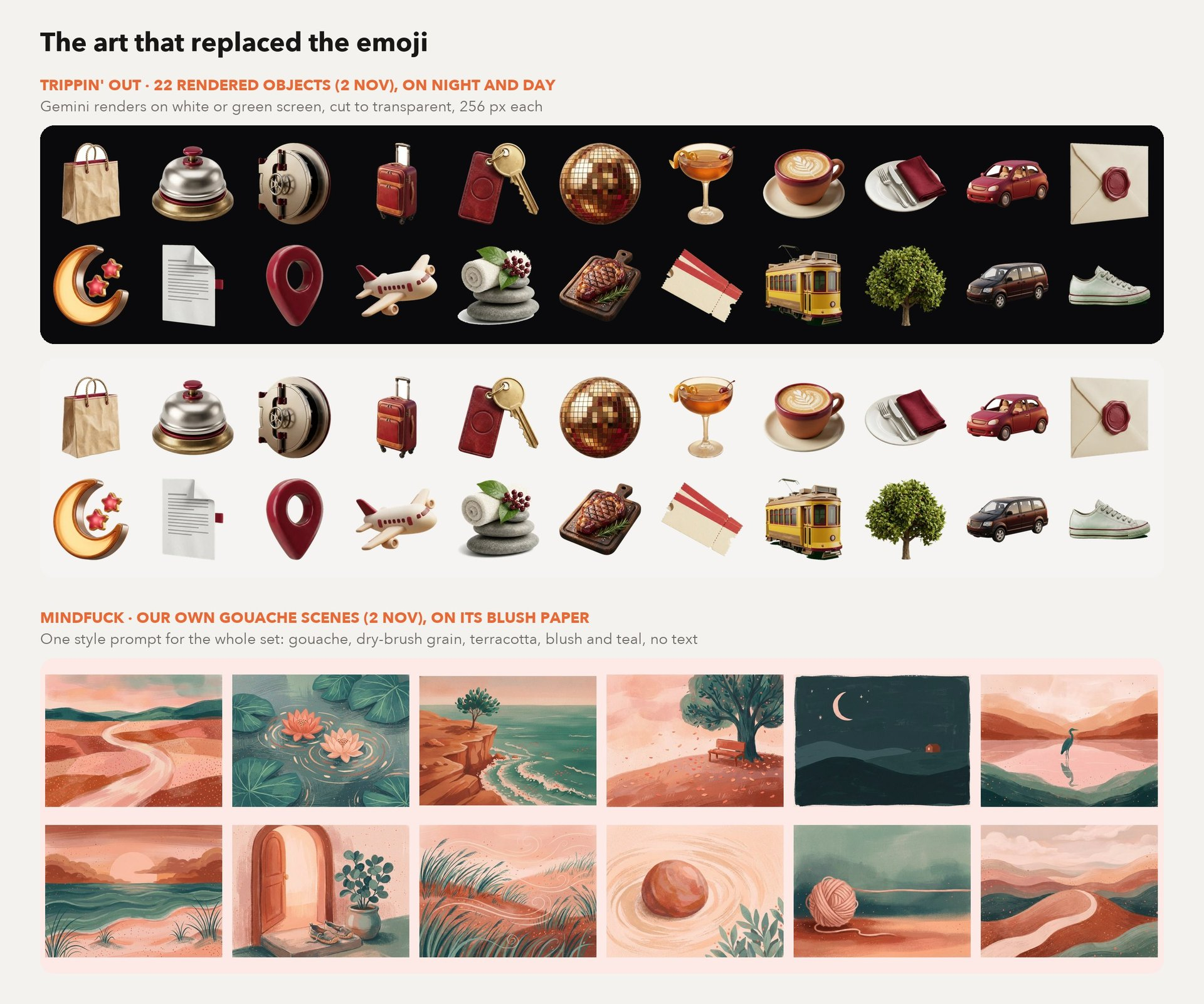
- All the art is made in-house: Google’s Gemini image model, one style prompt per app, then cleaned up in code. Trippin’ Out’s 22 objects took about 2 minutes and cost close to $0 for the whole set.
- Look at the white stuff: the paper, the sneakers, the tickets. Those were rendered on a green screen and keyed out. The coloured ones were rendered on white and cut out. That’s why they sit cleanly on both the night page and the day page, at about 15 KB each.
- The news apps got real photos too: every story in Anchorman and Forge HQ now carries a picture. The server checks that each one actually loads in Safari before keeping it. In one week, 19 of ~680 were dead or blocked.
Trippin’ Out and Built to Last: glyphs out, objects in
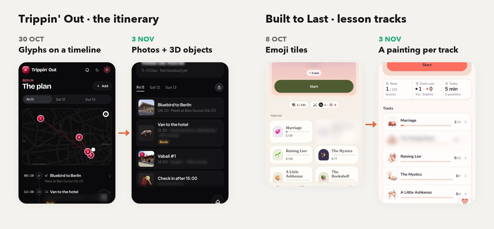
- Look down the itinerary: on 30 Oct it’s tiny glyphs. On 3 Nov it’s a hotel bell, a key fob, a cocktail, a tram and a wax-sealed envelope, in the spirit of Airbnb’s 2025 icons.
- Stops show the actual place: 5 photos per stop from its Google Maps listing, swiped like a hotel listing.
- The critic noticed: the average went from 5.8 to about 7.0 in four days. The app is five days old and already has 71 commits.
- Built to Last: emoji tiles on 8 Oct. Now each lesson track has its own painting, 7 new images in total.
- Hotel names, prices and two text lines are blurred on purpose.
Mindfuck: neon out, gouache in
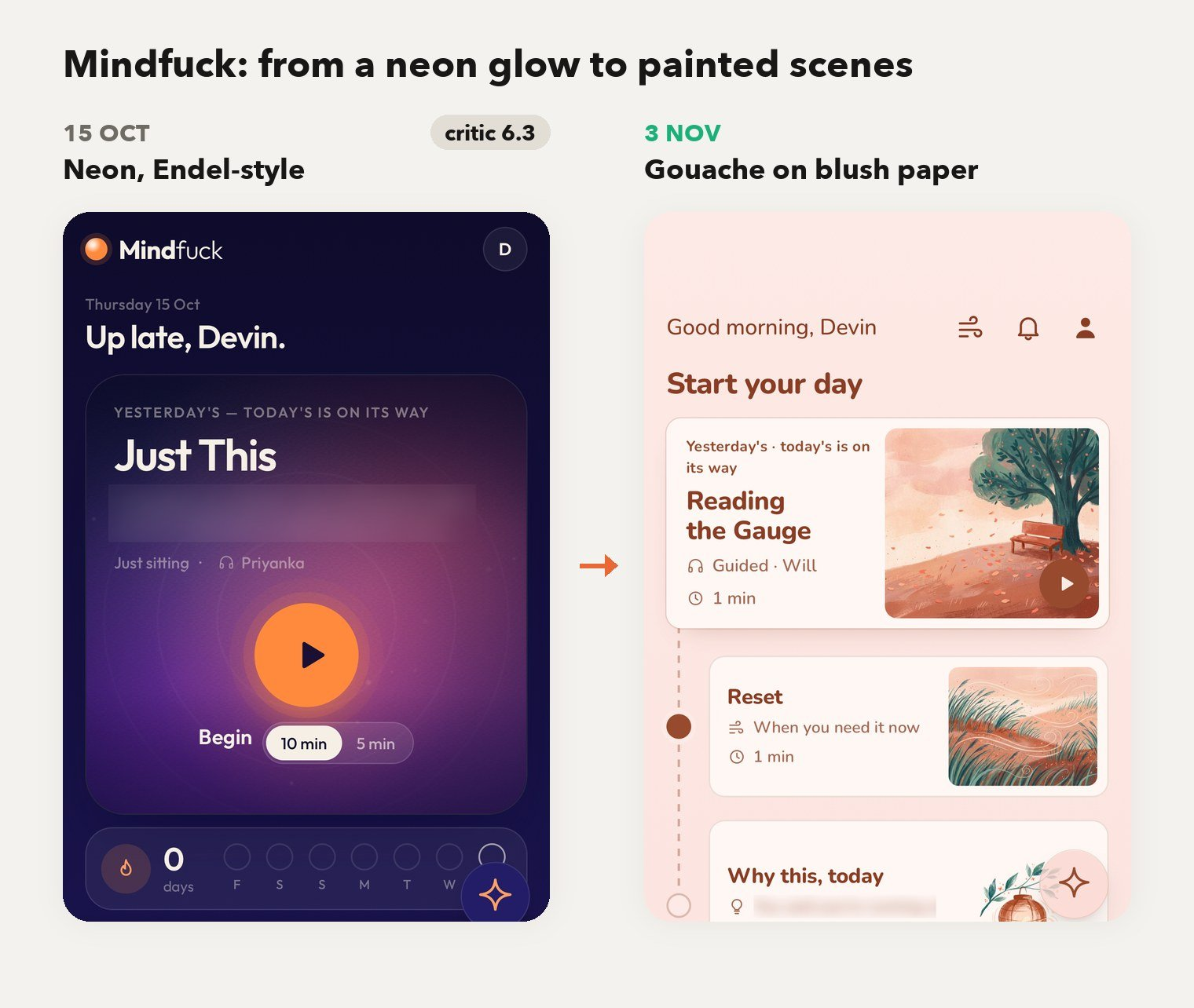
- Same phone, different universe: on 15 Oct it was “Headspace, made futuristic”, with a neon glow and a 6.3 from the critic after two rounds. Meditating inside a nightclub, basically.
- Now it looks like paper: blush paper and terracotta ink, in the spirit of Henry Shukman’s The Way.
- 29 of our own gouache paintings: all from one prompt (dry-brush grain, terracotta, blush and teal, “painted on pure white, no text”).
- I’m an art director now, apparently: two takes of every painting, and I picked the better one off a contact sheet. Daphna remains unimpressed.
Also today
- Anchorman: tap the disc on a briefing or an open story, and the chat opens already on that story with three questions about it.
- Life OS and OpenClaw kept their system map and inbox snapshots fresh on their own while I did literally nothing.